字体设计基础----字符间距
来源:sc115.com | 298 次浏览 | 2011-06-29
标签: 字体设计 字体设计基础 字符间距
Spacing. Some words about spacing type. Much more important than the shapes of the characters, is the rhythm of the type. A typeface with beautiful characters which are badly spaced is extremely hard to read. However, if the shapes of the letters are not that good, but when they are all perfectly spaced, the type will be fairly easy to read. Defining the rhythm is more important than defining the shapes.
字符间距
这里要说一下字符间距。字符的间距要比它的外形重要得多,这关系到字体的节奏。一种间距很糟糕的字体,不管外形如何优美,一样难于阅读。相反的,一款外形稍欠的字体,如果有完美的间距调节,这种字体一样可以易于阅读。因此,定义字体的节奏,要比定义字体的外形更加重要。
The white spaces inside and in between letters are defining the rhythm, much more than the black shapes of the letters. When you manage to create a good rhythm in your line of text, your type gets more readable and gives a balanced end result. While creating the black shapes, you have to take the white spaces into consideration. Because the white spaces are more important than the black shapes. However, white cannot exist without black. Changing a white shape, inevitable will have an influence on the black shape. From that perspective, one colour cannot be more important than the other.
是字符内部和字符之间的白空间决定着字符的节奏,而非字符的黑色形体。如果你能够为你的文本建立一种很好的节奏,你的字体就更易于阅读,并获得均衡的整体效果。从创建黑色形体的时候起,你就应该同时把白空间的设置考虑在内。当然,白空间和黑空间是互相依存的。白空间的改变也必然的会影响黑空间的形态。从这个角度来看,我们不能说黑与白哪个更重要。
For example, there has to be a relation between the space inside an 'n' and the space between the 'i' and the 'n' (see drawing). In the top row you can see the space inside the 'n' is much much bigger than the space in between the 'n' and the 'i'. In the bottom row they are much more equal, and in this way you'll get a much better rhythm and more harmony in your line of text.
例如,字母n内部的白空间,以及i与n之间的白空间,两者之间必然会存在着一种联系(见图示)。在上面一行中,字母n内部的白空间要远大于i与n之间的白空间。在下面一行中,两者则要均衡得多,你也因而获得了更好的节奏,整个文本也更和谐。
The same goes for the inner form of the 'a' and the 'e' for example. There is a big relation between these two forms. If they have (optically) the same amount of white inside the character (=counter), your type will have a better rhythm as well.
同样的,小写a和e之间的内部空间也存在着这种关系。两个形状之间的联系非常紧密。这两个字符的内部白空间(counter,中文术语翻译为字怀/字谷/字币)在视觉上应当是等量大小的,这样你的字体才会有更好的节奏。
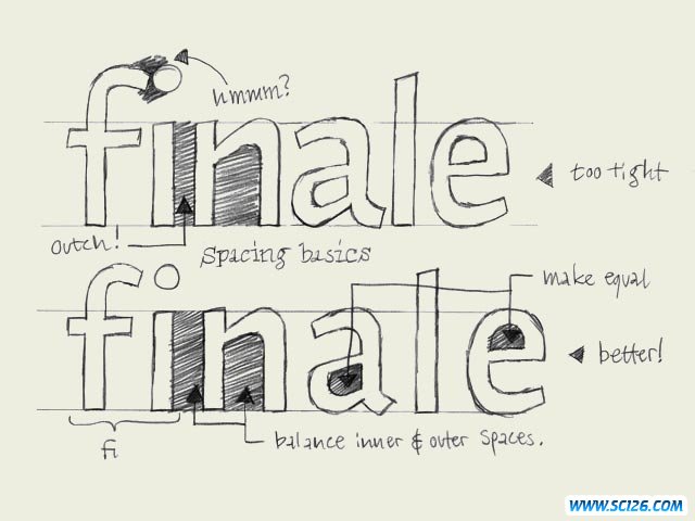
图片文字说明:
文字间距基础
上:太紧
下:a和e的内部空间应该是相等的
平衡字符的内空间和外空间
搜索: 字体设计 字体设计基础 字符间距
- 上一篇: 字体设计基础----黑与白
- 下一篇: 字体设计基础----线稿的数字化
 多种冰激凌和蛋糕PNG图标
 精美蔬菜高清图片4
 精美蔬菜高清图片2
 精美蔬菜高清图片3
 精美蔬菜高清图片1
 景观效果图素材
 景观效果图素材
 手机高清图片
 景观效果图素材