Chris & Lee : Logo and Packaging Concept包装设计(非原创),
此作品原作者为 LauraBrewer
Problem
Chris&LeeasmallnaturalfoodcompanyisscheduledtoexpandintoWholeFoodsmarketandarelookingtocreatepackagingfortheirproductsthathaveonlybeenavailableatlocalfarmersmarkets.
Concept
TokeepconsistentwiththecharmandpersonalapproachChris&Leebringtotheircustomersatfarmersmarketsthedesignforthelabelswaskeptveryhumanisticwithcleanlabelsmimickingthehand-writtenchalksignsandlabelsfoundatfarmersmarketsaswellasWholeFoodsMarket.
Solution
Thetexttreatmentoneachlabelisapairingofmoremasculinetypeinallcaps,representativeofChris,withamorefemininelightfluidshapes.Thispairingbeginswiththelogowhichissetinapurposelyimperfectcircletokeepitsetapartfromthecompletelytextdrivenlabel.Insteadoffeaturingtheliteralproductname“TheFlavorOf…”describestheuniquequalitiesoftheproductChris&Leearemostproudof.Onthebackthesametonecarriesoverintotheingredients,directions,andexpirationdatewhichareincorporatedintoaparagraphwritteninfirstpersonasifChris&Leewereinyourkitchenorinthesupermarketaislesharingtheirproductwithyou.
Research
TounderstandthefeeloffarmersmarketsandWholeFoodsresearchwasdonebothonsiteandonline,whichleadmetobeimmediatelyattractedtotheuniqueandpersonaltouchhandwrittenchalksignsbringtotheirenvironment.WhenatWholeFoodsIalsofoundmanynaturalfoodcompanieschosetousepredominatelywhitewithburstsofcolor.IwantedtosetChris&Leeapartwithoutaddingtotheclutterbystillcreatingacleandesign,butsettingitinonlyblackandwhitewhichwouldalsokeepprintingcostslowforChris&Lee.
Chris & Lee : Logo and Packaging Concept包装设计(非原创)
来源:sc115.com | 117 次浏览 | 2012-05-06
标签: Chris & Lee Logo and Packaging Concept包装设计(非原创)
搜索: Chris & Lee Logo and Packaging Concept包装设计(非原创)
- 上一篇: 2012
- 下一篇: 精选国外优秀的包装设计
 Roman Babin标志设计作品
 Miguel Sousa创意3D数字设计
 Ck Chiwai Cheang字体设计作品
 8½ Magazine杂志版面设计
 电影海报欣赏:佩小姐的奇幻城堡(Miss Peregrine's Home for Peculiar Children)
 26个国外品牌和logo设计集锦
 The Sandeman Chiado餐厅品牌形象设计
 优秀包装设计精选集(116)
 Collected Coffee咖啡品牌形象设计
 2016欧洲杯极简风格海报设计
 2012
2012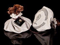 令人垂涎的巧克力包装设计
 34张精彩的海报设计作品
 Sabadì
 国外啤酒公司品牌设计欣赏第二季
 国外啤酒公司品牌设计欣赏第一季
 时尚创意包装设计
 CORE-- 一家欧洲新生代伏特加年度新品牌新LOGO和包装展示
 欧美COOPER& FORD咖啡品牌包装设计
 中药草药系列标清素材01
 蔬菜水果标清素材-紫玉米01
 蔬菜水果标清素材-紫薯01
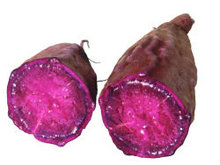 蔬菜水果标清素材-紫薯02
 人人网LOGO矢量图
 卡通玩偶矢量图
 夏之韵清新夏天海报psd素材
 清凉夏日冰爽到底海报psd素材
 缤纷时尚冰爽夏日海报psd素材
SQL Error: select * from ***_ecms_hb where newstime < '1336233600' order by id DESC limit 20